Support Analytics: turning thousands of tickets into answers
Note: Some details and screenshots have been redacted in accordance with company policy.
When you’re running a support team for warehouse robots, tickets pile up fast. Thousands of them, each describing a robot that misbehaved somewhere in a warehouse. You start asking questions that no single ticket can answer. Where do issues cluster physically? Which device keeps failing? Is a site getting more reliable or less? Are we seeing more hardware issues this month than last?
I built a support analytics tool to answer these questions. It connects to our ticket system, enriches each ticket with telemetry and location data, and presents everything through six interactive dashboards. This post is a showcase of what the tool does and why each piece exists.
The problem
Our support team uses Azure DevOps to track issues across multiple warehouse sites. Each ticket captures what went wrong, which devices were involved, and how it was resolved. But the tickets are isolated. Reading any one of them tells you about a single incident. There’s no way to zoom out and see the bigger picture — trends, patterns, hotspots, reliability over time.
We needed a tool that could take all those tickets and turn them into something actionable. Not just charts for the sake of charts, but answers to the questions that come up in every weekly sync: What’s breaking most? Where? Is it getting better?
Metadata collection at ticket creation
The foundation of the whole system is a simple philosophy: collect rich metadata when a ticket is created, so analysis is effortless later.
When a support engineer creates a ticket through our Slack app, the system automatically captures much more than a title and description:
- Device identifiers — which robots, stations, elevators, and battery exchangers are involved
- Physical location — the robot’s actual warehouse coordinates at the time of the incident, pulled from telemetry data
- Time of occurrence — a precise timestamp, not “sometime this morning”
- Grafana deep links — one-click links to the relevant logs and dashboards, pre-filled with the right time window and devices
- Rosbag uploads — device recordings from around the time of the incident, automatically uploaded and linked
- Software version — which release was running when the issue happened
The support engineer fills in the basics. The system handles the rest. That 30 seconds of automated collection at creation time is what makes every dashboard possible. Without structured metadata, you’re left manually digging through tickets to answer even basic questions.
Hierarchical issue categorization
Support tickets come with tags, but tags are flat. A ticket might be tagged “motor failure” or “navigation,” but there’s no way to say that motor failures are a subset of hardware issues, which are a subset of robot issues.
The tool organizes tags into a tree. Each tag has a parent, forming a hierarchy that lets you start broad and drill down. At the top level you might see “hardware” and “software.” Click into “hardware” and you see “robot,” “station,” “elevator.” Click into “robot” and you see “motor failure,” “sensor issue,” “battery.” This hierarchy is what powers the category distribution dashboard.
When a ticket has multiple tags at different levels, the system automatically picks the most specific one — the deepest in the tree — so every ticket gets counted where it’s most informative.
The dashboards
The heart of the tool is six interactive dashboards, each answering a different question.
Category distribution
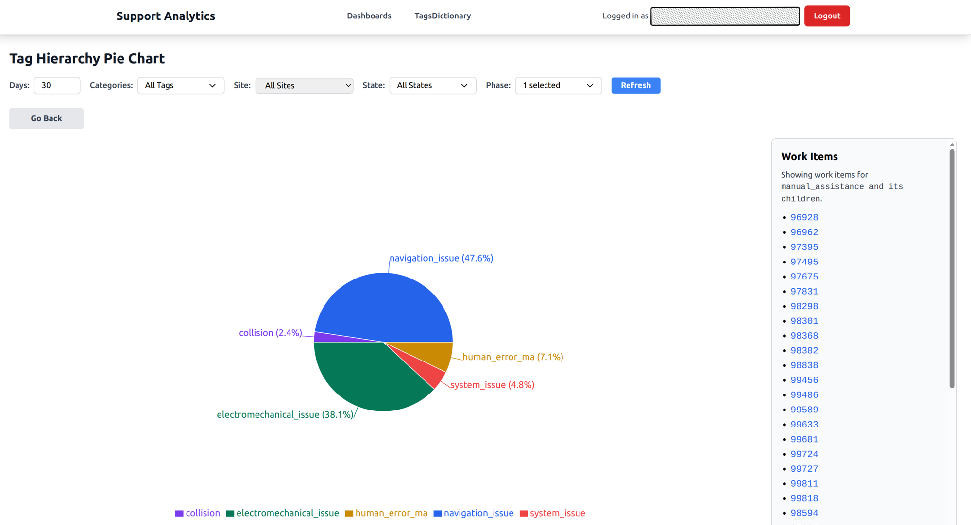
An interactive pie chart that mirrors the tag hierarchy. It starts with top-level categories and the proportion of issues in each. Click a slice to drill down into subcategories. Keep clicking until you reach individual tickets.
What it answers: What types of issues are we seeing most? When a new failure mode starts trending, it shows up as a growing slice. When a fix rolls out and works, you watch it shrink.
Location heatmap
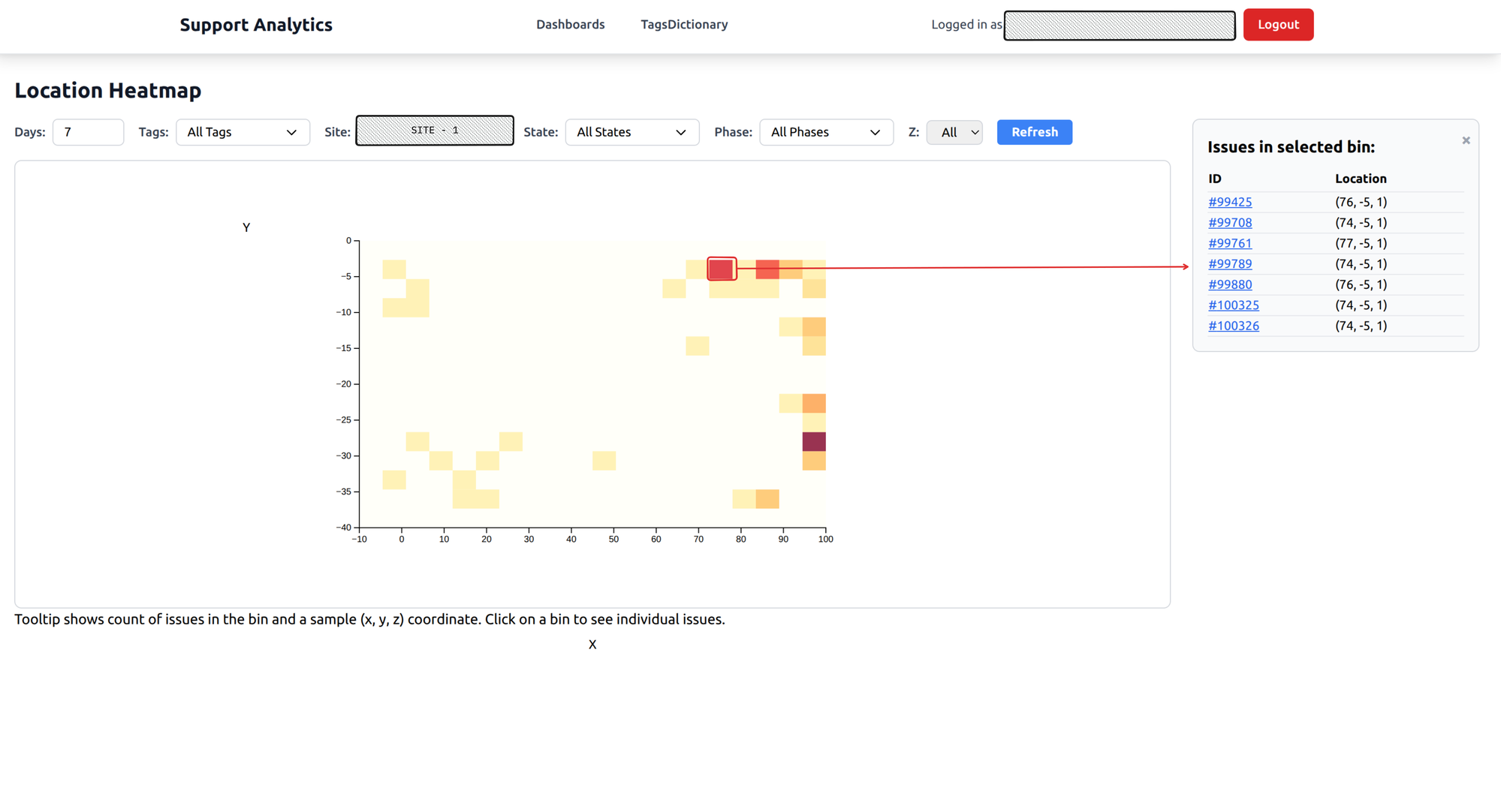
A spatial heatmap of the warehouse floor. Color intensity shows where issues concentrate. Hot spots jump out immediately — a corridor where navigation fails, a racking section where robots get stuck.
You can filter by floor level for multi-story warehouses, and click on any hot spot to see the specific issues that happened there.
What it answers: Are there physical hotspots where robots fail? Spatial patterns are invisible when you’re reading individual tickets, but they’re obvious on a heatmap.
Time series analysis
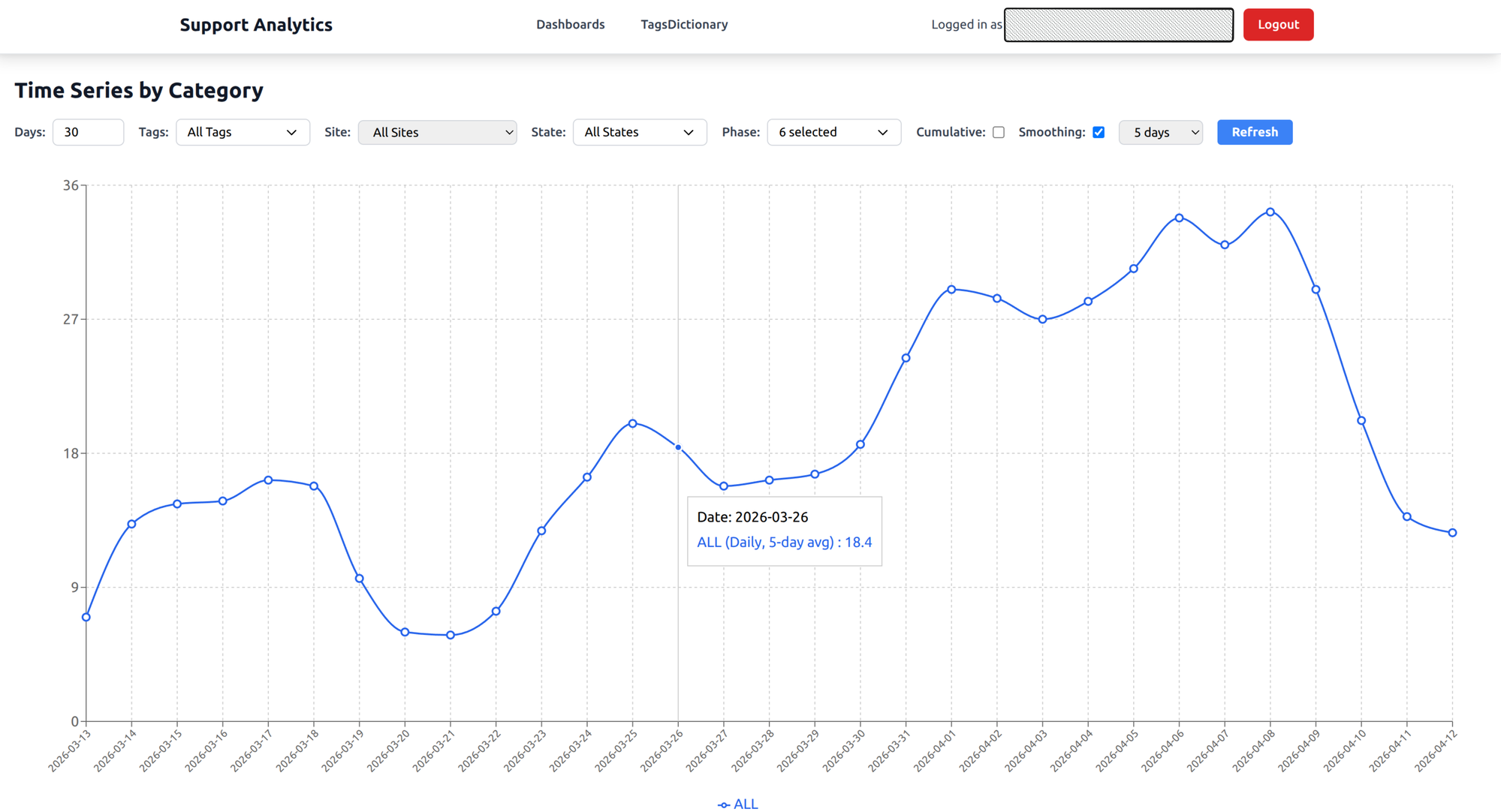
A line chart showing issue creation trends over time. Toggle between daily counts and a cumulative view. Apply smoothing to cut through the day-to-day noise and see the real trend.
What it answers: Are issues increasing or decreasing? When did a spike happen? After a software release or warehouse expansion, this chart tells you whether things got better or worse.
Device distribution
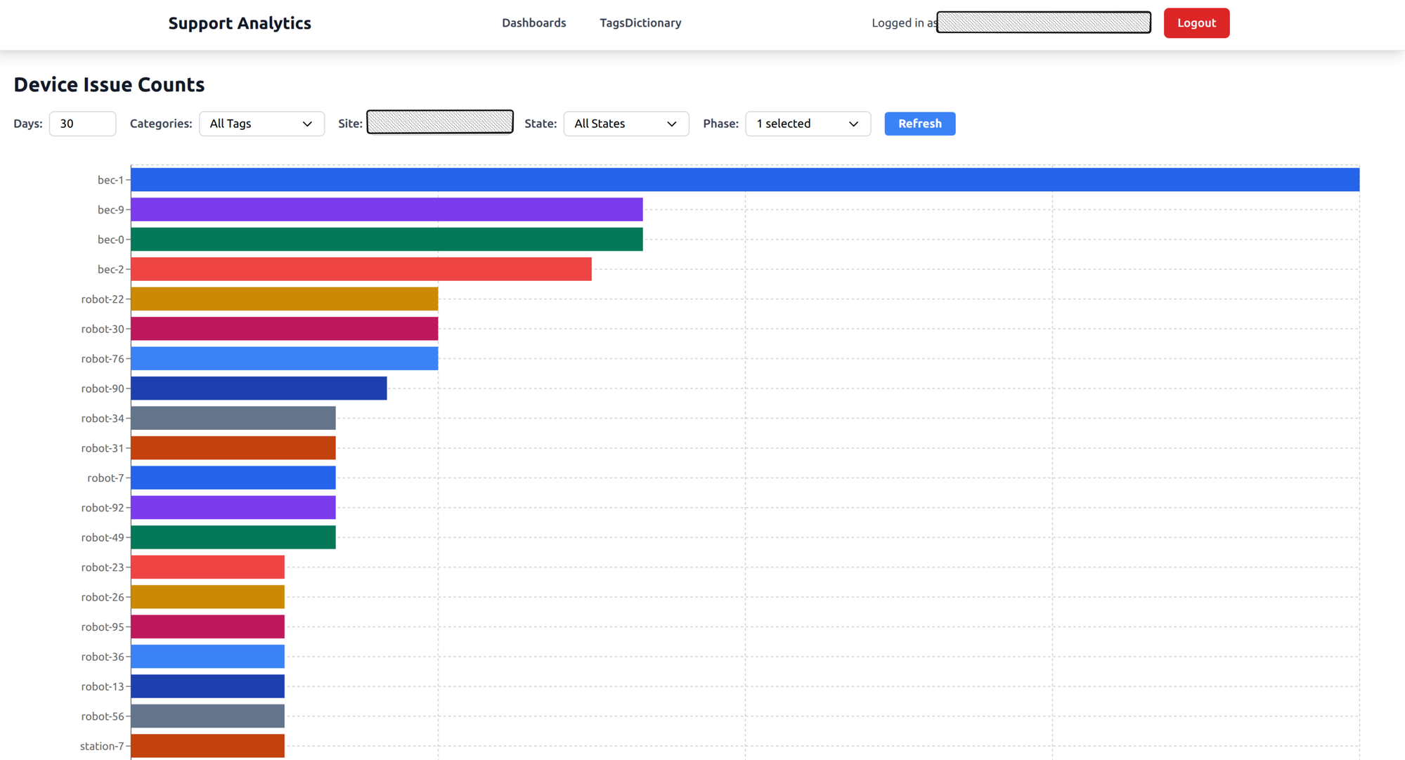
A horizontal bar chart showing which specific devices have the most issues, grouped across all device types — robots, battery exchangers, elevators, stations.
What it answers: Which specific device needs attention? If one robot has three times more issues than its peers, it probably needs maintenance or replacement.
Site uptime
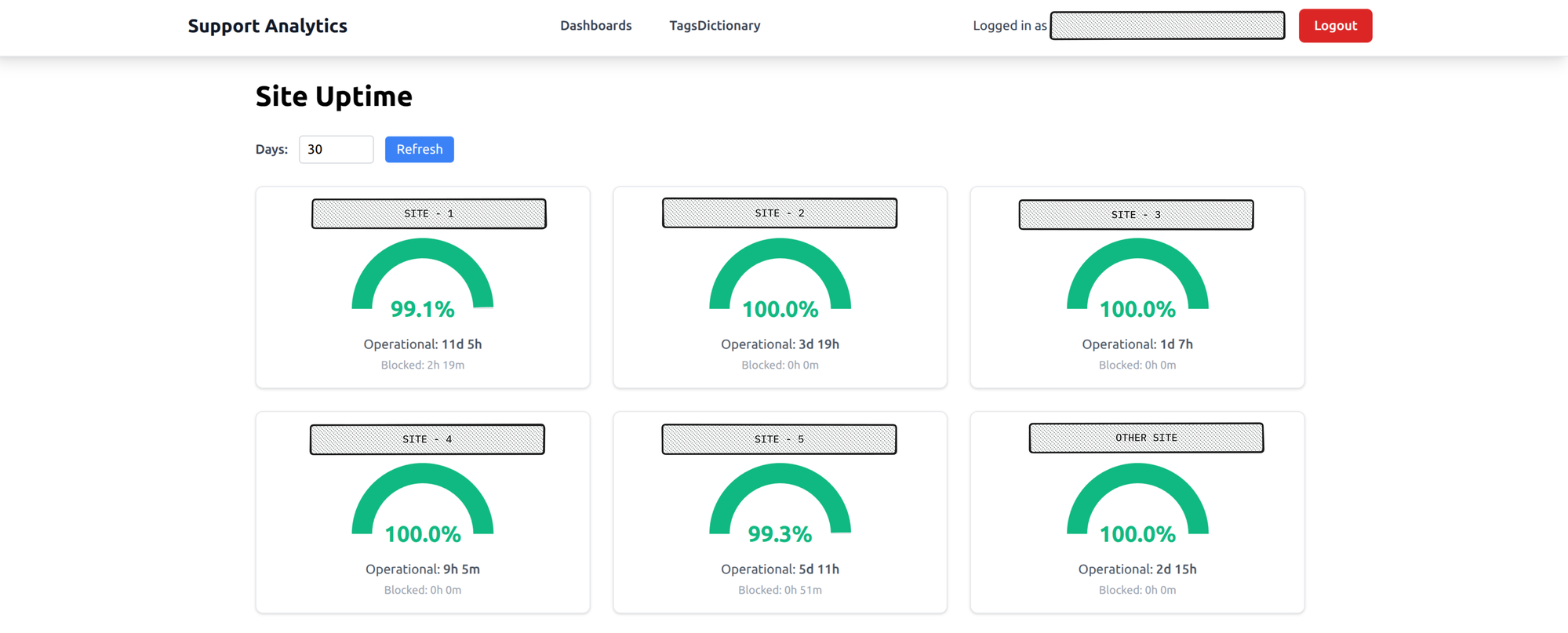
Gauge charts for each warehouse site showing uptime percentage, color-coded green, amber, or red. At a glance you can see which sites are healthy and which aren’t.
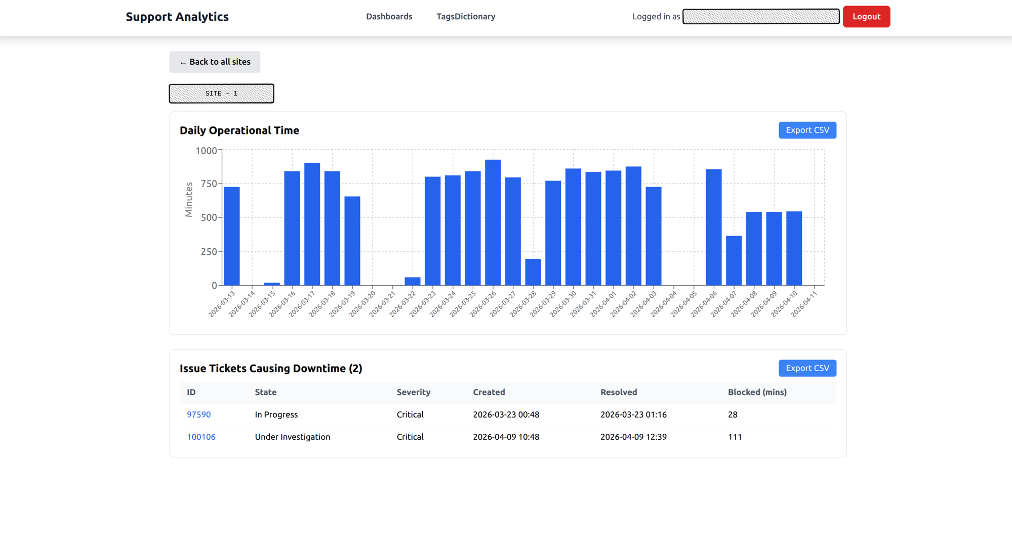
Click on a site for a drill-down: daily operational minutes, plus the specific tickets that caused downtime. Data can be exported as CSV for reporting.
What it answers: How reliable is each warehouse site? This is the chart that gets pulled into weekly status meetings.
Wrapping up
The core idea behind this tool is simple: invest at creation time, benefit at analysis time. By automatically collecting rich metadata — device IDs, location coordinates, timestamps, log links — when a ticket is created, every dashboard has what it needs without anyone going back to fill in the blanks.
What started as a way to answer “what’s breaking most?” turned into something the team relies on daily. Category distribution surfaces trending failure modes. The heatmap reveals physical patterns no one would spot by reading tickets. Device distribution flags hardware that needs attention. And time series analysis and site uptime give leadership the visibility they need to track reliability and make decisions.
Building this tool gave me the opportunity to solve a real problem — making data more visible to the people who need it. Along the way, I got to build data pipelines, work with Elasticsearch telemetry, and explore new technologies like Apache Airflow for workflow orchestration. It’s been one of the most rewarding projects I’ve worked on.